



PROJECT OVERVIEW
Fresh and Fruity: Rebranding, reimagining, and redesigning City Fruit's mobile website
City Fruit is a mobile website UI rebrand for a real, local client. As part of a course on visual communication, I was tasked to redesign a new visual design system and user task journey using what I have learned about visual language principles such as composition, typography, color, balance, imagery, etc.
The end product is a reimagined flow for requesting tree care service options with updated visual branding throughout the website.
My role
UX design intern
Brand Strategist
Time frame
5 weeks
Tools
Figma
Miro
MY ROLE
UX Designer
Brand Strategist
UX Designer
Brand Strategist
TIME FRAME
5 weeks
5 weeks
TOOLS
Figma
Figma
"City Fruit promotes urban fruit to nourish people, build community and protect the climate."
"City Fruit promotes urban fruit to nourish people, build community and protect the climate."
"City Fruit promotes urban fruit to nourish people, build community and protect the climate."
WHO IS CITTY FRUIT?
WHO IS CITY FRUIT?
City Fruit is a local non-profit organization that takes advantage of and protects the resources provided by the co-existence of both city and tree.
City Fruit is a local non-profit organization that takes advantage of and protects the resources provided by the co-existence of both city and tree.
City Fruit is a local non-profit organization that takes advantage of and protects the resources provided by the co-existence of both city and tree.
They believe in protecting urban fruit trees, harvesting urban fruit, and educating the urban population in order to promote food justice and positive fruit-to-community relationships.
Their primary audience is those of the greater Seattle area who are actively looking to volunteer with City Fruit and reflect the value of giving back and sustainability that City Fruit holds.
Task Flow Redesign: Filling Out Tree Care Service Form
Task Flow Redesign: Filling Out Tree Care Service Form
Task Flow Redesign: Filling Out Tree Care Service Form
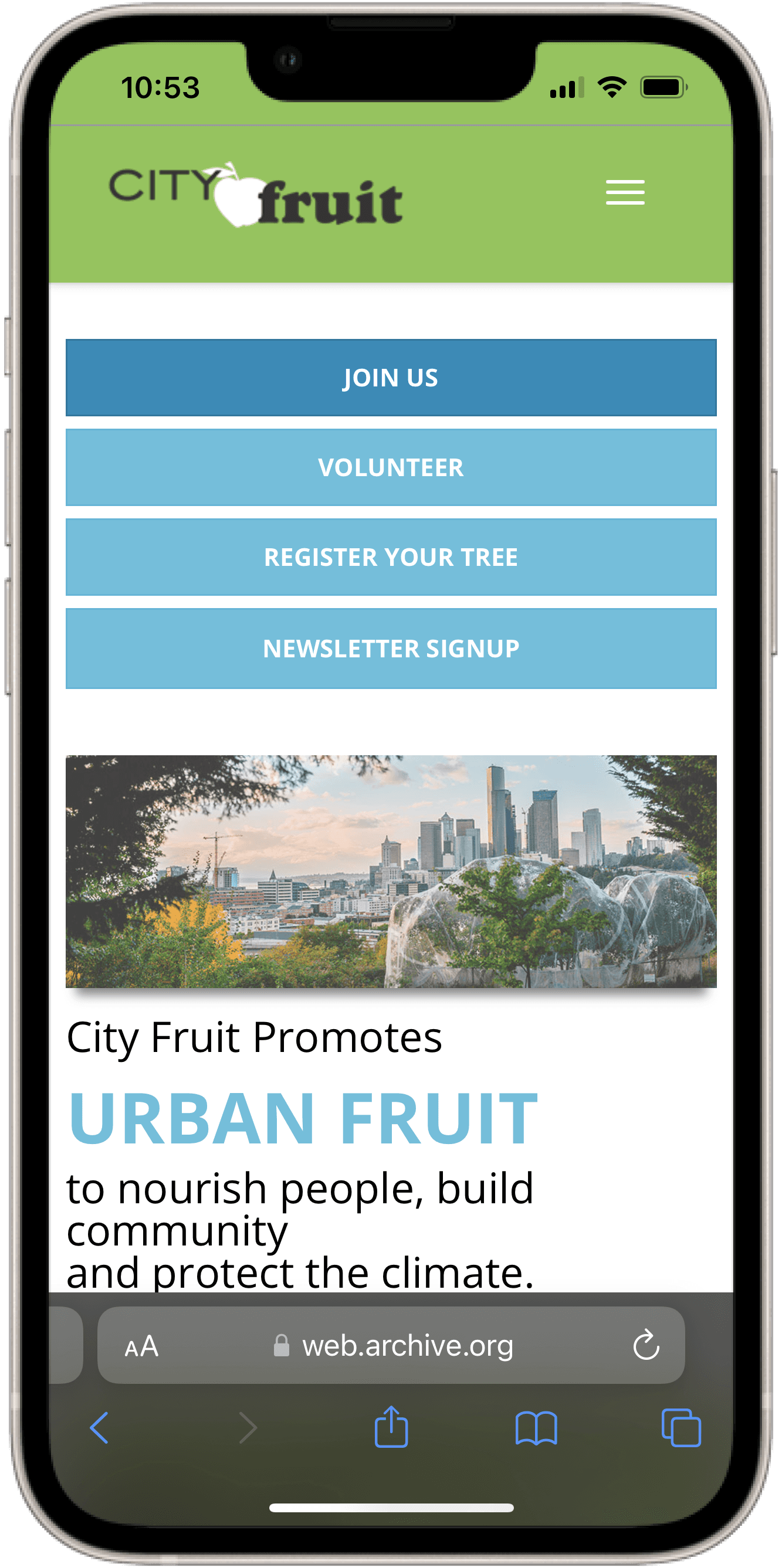
I visited City Fruit's mobile website to dissect their current task flow journey for pain points and major UX violations
I did this by evaluating each screen associated with the task of filling out a tree care service form. I reviewed each screen based on industry-standard UX heuristics such as consistency and standards, recognition rather than recall, etc.
This step was necessary to uncover areas of opportunity for UX improvement before moving to ideation.
Homepage
Inconsistent text/button styles, hierarchy, and spacing
Lack of intention with visual branding
Inconsistent text/button styles, hierarchy, and spacing
Lack of intention with visual branding
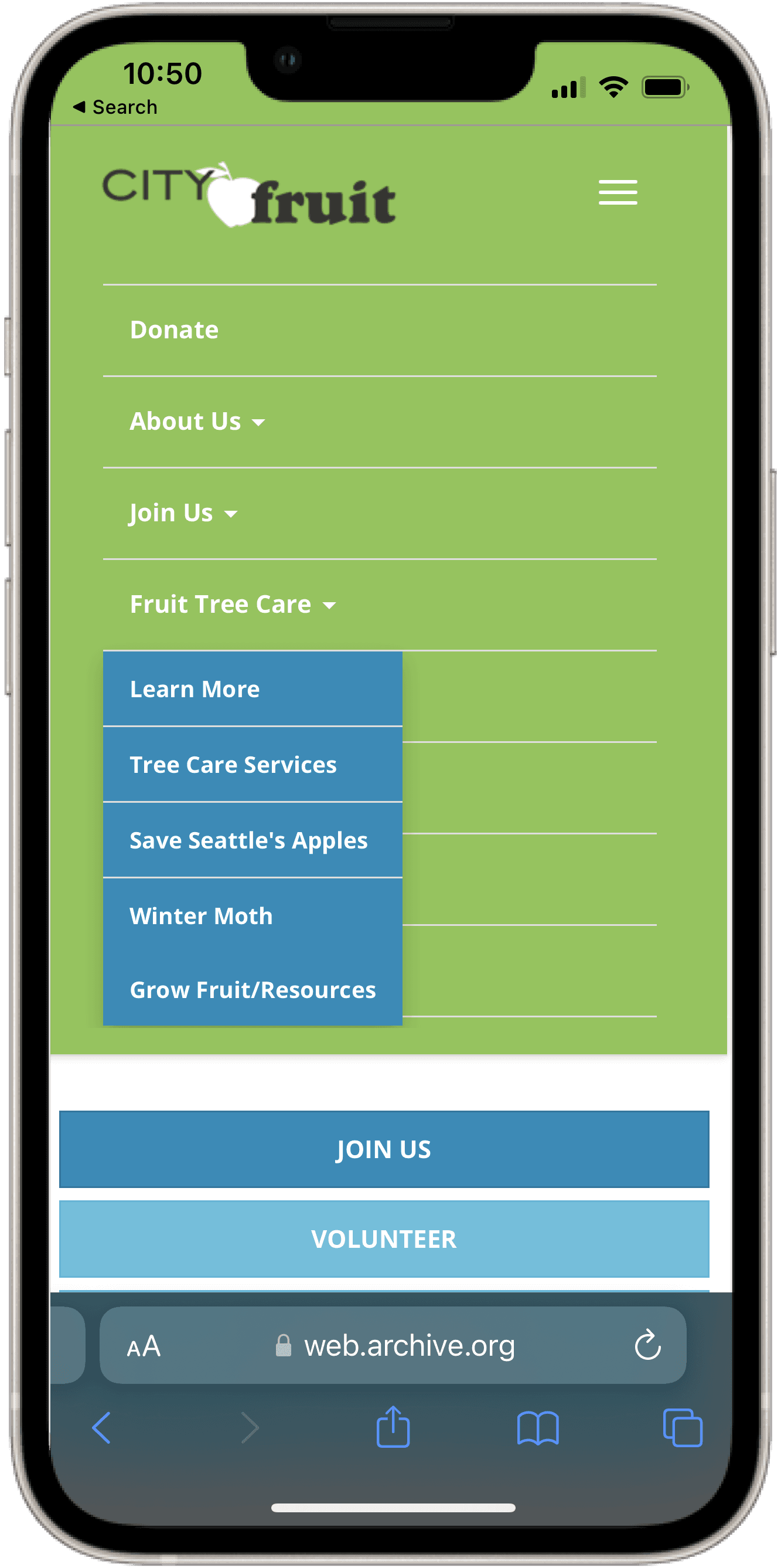
Menu
Dropdown sub-menu currently blocks other options from being seen
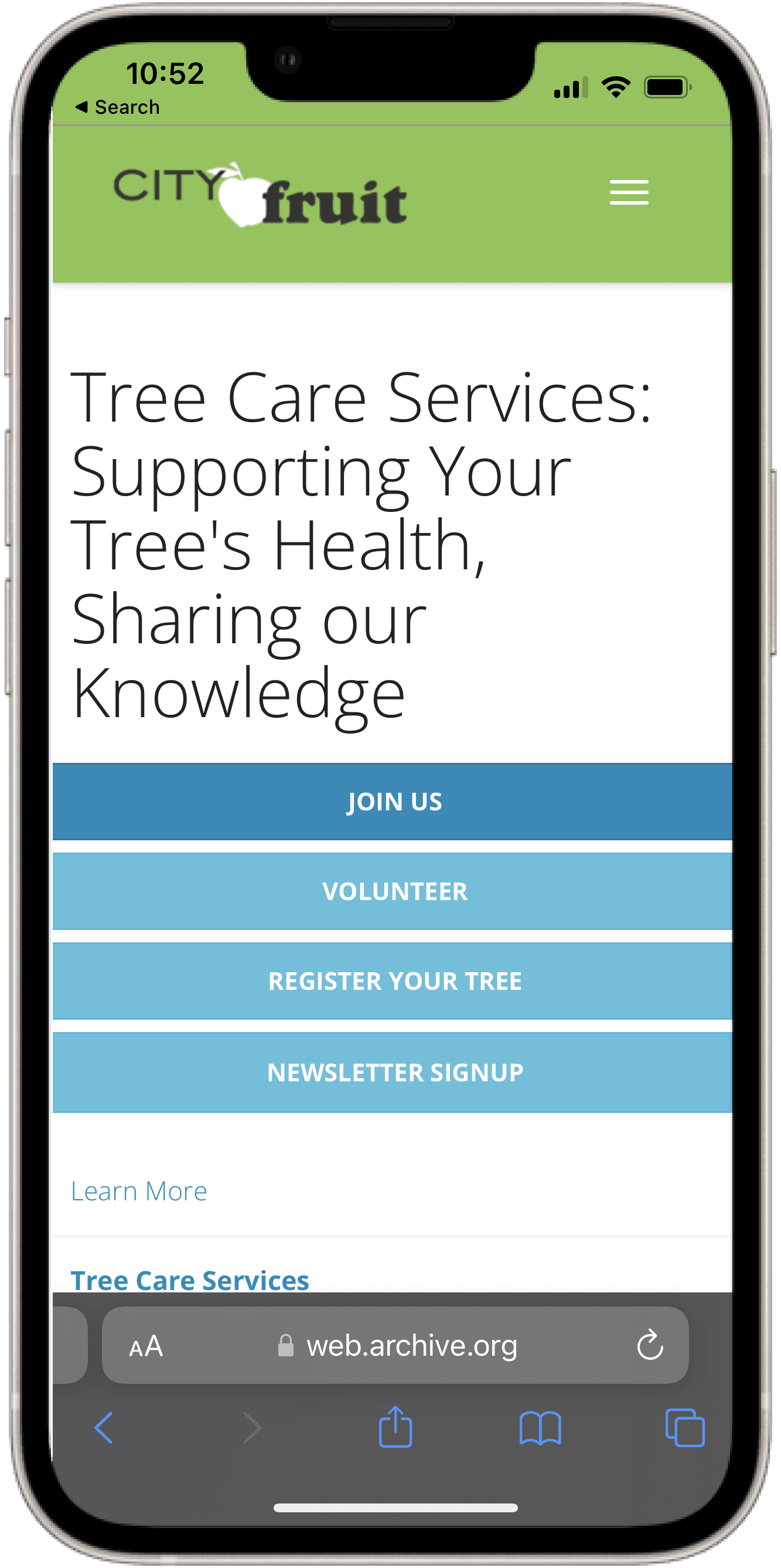
Tree Care Service Page
Similar to homepage— inconsistent text/button styles and hierarchy
Button placement is distracting from content page-specific content
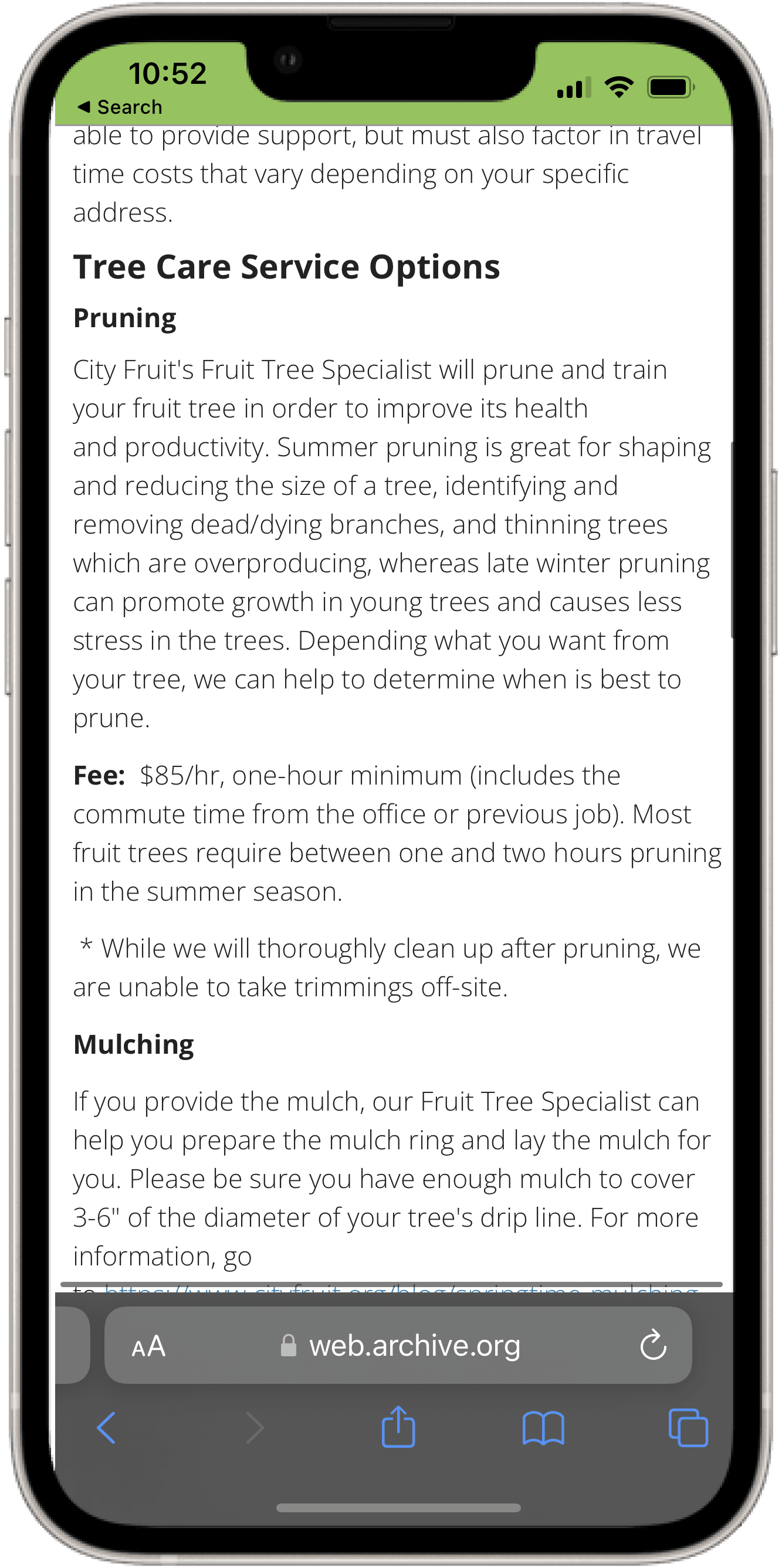
Tree Care Service Page: Service Options
Weak text hierarchy
All information displayed on the screen at once—very dense
Little use of whitespace
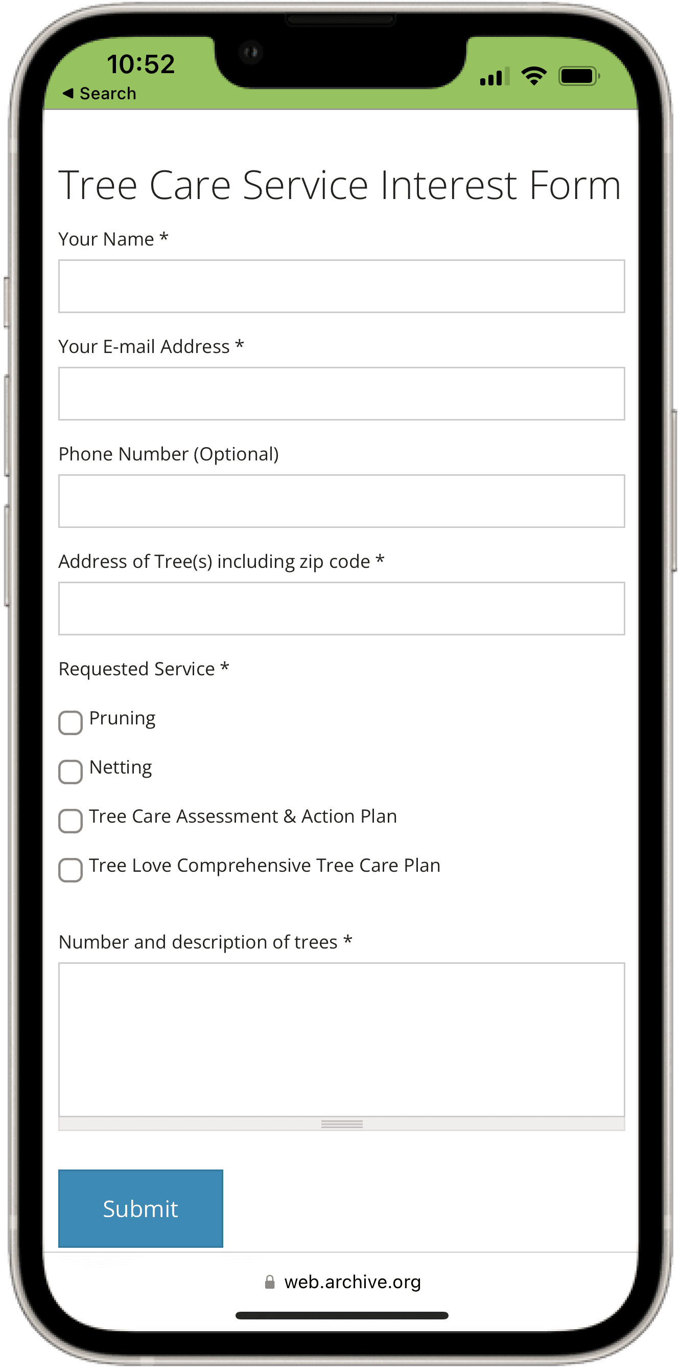
Tree Care Service Page: Interest Form
Lots of scrolling needed to access interest form
No indication of what asterisks imply to users who may not know

Tree Care Service Page: Service Options
Weak text hierarchy
All information displayed on the screen at once—very dense
Little use of whitespace
From these insights, I created lo-fi wireframes to play with ideas and ultimately enhance this flow
From these insights, I created lo-fi wireframes to play with ideas and ultimately enhance this flow
The overall flow itself was short, sweet, and simple, however, a visual design treatment was necessary to simplify visual relationships between elements and reduce the cognitive load on users.
General principles of design were followed throughout the redesign of the interfaces such as appropriate margin sizes, padding, balance, and consistent design styles, but here are the more specific improvements to each page:

Homepage & Dropdown Menu
Homepage & Dropdown Menu
Use of text styles and buttons for consistency
Horizontal scrolling through blog posts to save screen space and define a distinct section for the posts
Full-screen menu navigation to eliminate any distracting elements from the homepage
Drop down sub-menu under "Fruit Tree Care" opens so that it does not block other options on the screen
Tree Care Service Page
Tree Care Service Page
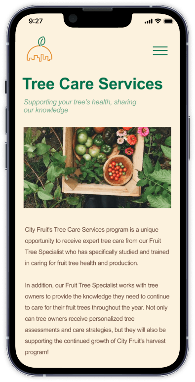
Stronger text hierarchy, weight, line spacing, and use of white space for a clearer display of information
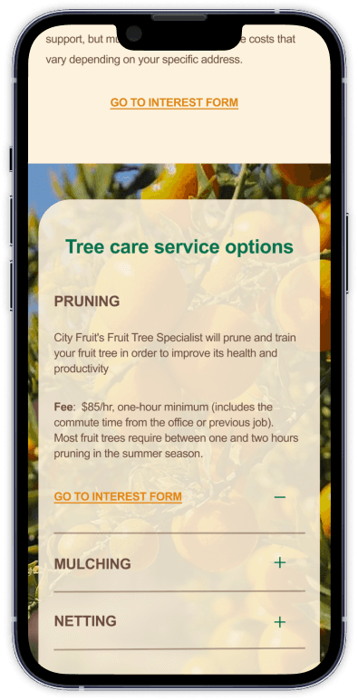
Accordian subsections for tree care service options to minimize scrolling, reduce clutter, and improve scannability.
"Go to interest form" hyperlink after page information and within each sub section so users do not need to scroll all the way down once they have made a decision
Explanation for asterisks for required information

I visited City Fruit's mobile website to dissect their current task flow journey for pain points and major UX violations
I did this by evaluating each screen associated with the task of filling out a tree care service form. I reviewed each screen based on industry-standard UX heuristics such as consistency and standards, recognition rather than recall, etc.
This step was necessary to uncover areas of opportunity for UX improvement before moving to ideation.


Homepage
Inconsistent text/button styles, hierarchy, and spacing
Lack of intention with visual branding


Menu
Dropdown sub-menu currently blocks other options from being seen


Tree Care Service Page
Similar to homepage— inconsistent text/button styles and hierarchy
Button placement is distracting from content page-specific content


Tree Care Service Page: Service Options
Weak text hierarchy
All information displayed on the screen at once—very dense
Little use of whitespace


Tree Care Service Page: Interest Form
Lots of scrolling needed to access interest form
No indication of what asterisks imply to users who may not know
I visited City Fruit's mobile website to dissect their current task flow journey for pain points and major UX violations
I did this by evaluating each screen associated with the task of filling out a tree care service form. I reviewed each screen based on industry-standard UX heuristics such as consistency and standards, recognition rather than recall, etc.
This step was necessary to uncover areas of opportunity for UX improvement before moving to ideation.


Homepage
Vertical scrolling through several blog posts instead of carousel
Inconsistent text/button styles


Menu
Dropdown sub-menu currently blocks other options from being seen


Tree Care Service Page
Similar to homepage— inconsistent text/button styles and hierarchy
Button placement is distracting from content page-specific content


Tree Care Service Page: Service Options
Weak text hierarchy
All information displayed on the screen at once—very dense
Little use of whitespace


Tree Care Service Page: Interest Form
Lots of scrolling needed to access interest form
No indication of what asterisks imply to users who may not know
Reinventing City Fruit's Identity
Reinventing City Fruit's Identity
Reinventing City Fruit's Identity
WHAT IS CITY FRUIT TRYING TO COMMUNICATE TO THEIR AUDIENCE?
To understand this, I completed a brand audit and thoroughly engaged with City Fruit's content across their entire website.
To understand this, I completed a brand audit and thoroughly engaged with City Fruit's content across their entire website.
To understand this, I completed a brand audit and thoroughly engaged with City Fruit's content across their entire website.
This included:
Learning about the services and events they provide and promote
Familiarizing myself with their core values, missions, and overall organizational goals
Evaluating the relationships between the language used, visuals chosen, and design elements implemented.
Through their use of language and provided services and events, it was clear their themes of building community surrounding a commitment towards urban fruit justice, however, there isn't a strong relationship between these goals and their current design system to communicate them effectively.
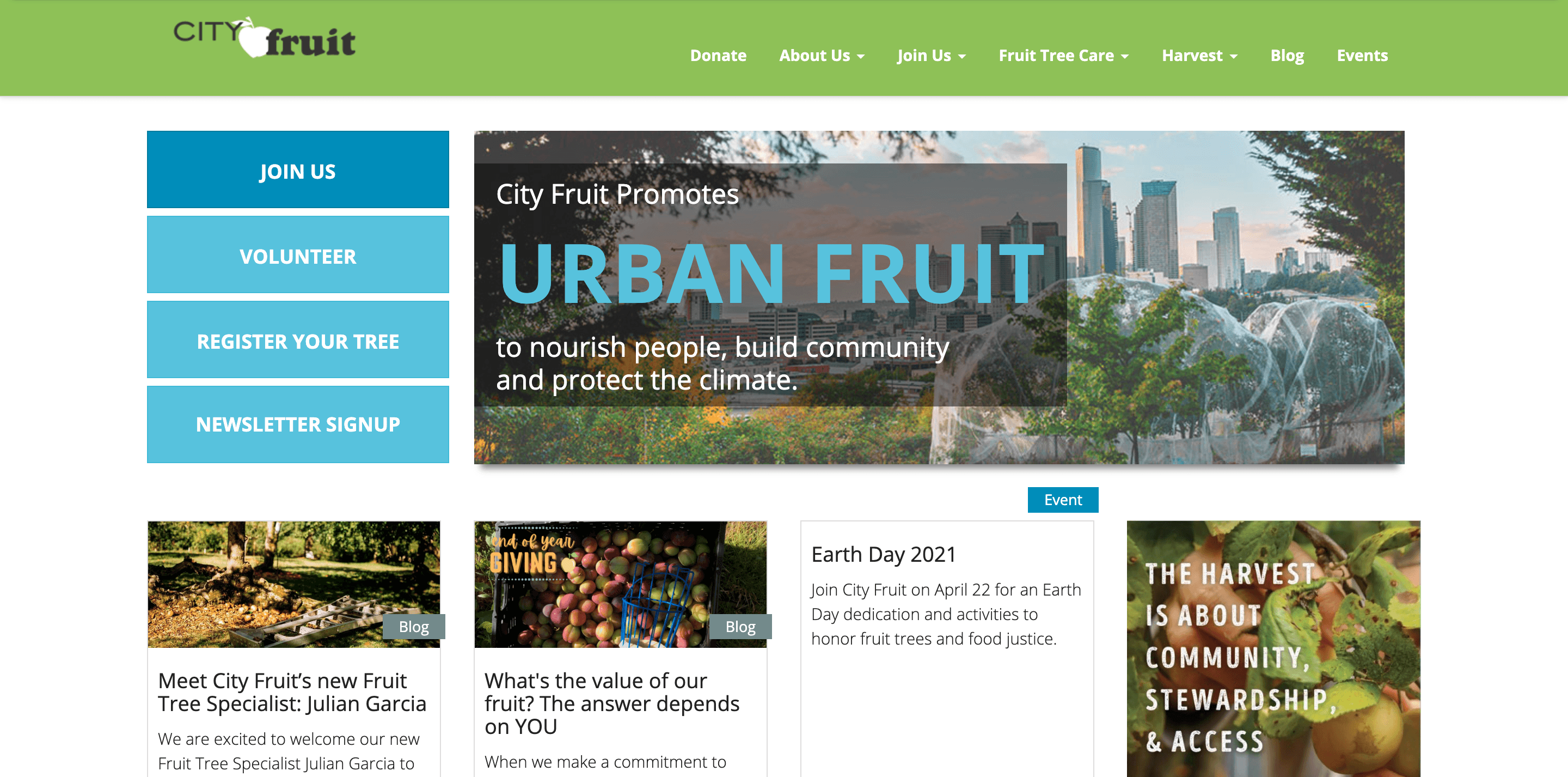
Desktop view of City Fruit's homepage
Desktop view of City Fruit's homepage
Thinking ahead about how to better convey City Fruit's brand identity, I summarized their 3 overarching communication goals.
Thinking ahead about how to better convey City Fruit's brand identity, I summarized their 3 overarching communication goals.
Thinking ahead about how to better convey City Fruit's brand identity, I summarized their 3 overarching communication goals.

Friendliness
Friendliness
Friendliness
Friendliness
Set a welcoming tone to establish a trusting relationship with volunteers & donors
Set a welcoming tone to establish a trusting relationship with volunteers & donors

Activism
Activism
Activism
Activism
Convey the value of environmental respect and justice within an urban setting
Convey the value of environmental respect and justice within an urban setting
Convey the value of environmental respect and justice within an urban setting

Community-driven
Community-driven
Community-driven
Community-driven
Demonstrate the community-based aspect of the organization and its impacts
Demonstrate the community-based aspect of the organization and its impacts
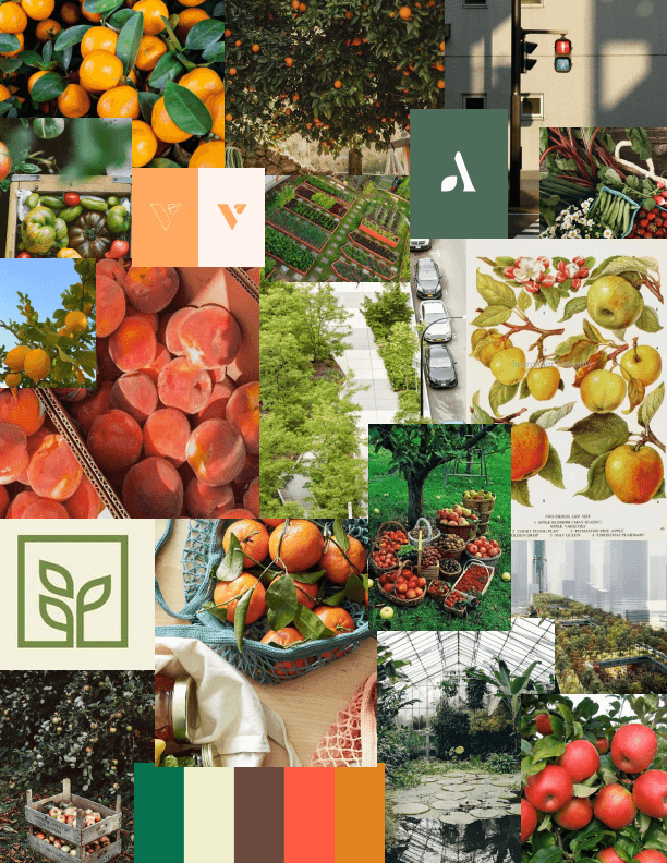
To kick-off the brand identity redesign process, I created a moodboard for visual inspiration
This curated collection of images allowed me to capture ideas, thoughts, and feelings that played an important role in forming the design direction of City Fruit's mobile website.
I found myself heavily inspired by warm, earthy tones and the playful comfort surrounding fruit imagery.
I also intentionally explored the visual contrast between nature and urbanity and how they are able to complement each other.
With a clear vision in mind, I ideated a newly branded version of City Fruit's logo
To start my ideating process, I first listed out multiple visual keywords that I could incorporate into the design of the logo and then created several initial sketches of possible ideas. By focusing on abundance, I was able to brainstorm creatively and allow ideas to continually build upon each other without restraint.
I played around with lots of ideas and even merged a few and finally decided on a design direction I thought best fit my rebrand vision.
